


The 18 Most Popular Bedding Colour Combinations of 2026 (So Far)
Exactly one month into the year, these looks have been added to carts over and over again.
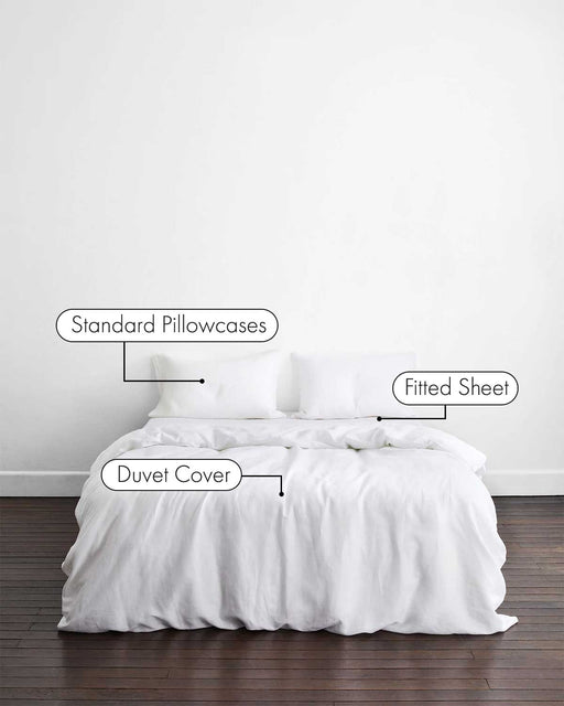
If you’ve ever Built Your Own Bedding Bundle, you’ll know the fun really begins when you start mixing colours. With five components to play with – a Duvet Cover, Fitted Sheet, Flat Sheet and two sets of Pillowcases – the possibilities add up quickly.
And with the arrival of our newest 100% Organic Cotton Percale shades, the numbers have skyrocketed. We’re talking seemingly endless potential combinations across linen and cotton – enough to make every bedroom feel completely bespoke.
In other words, colour is having a major moment in 2026. Our community is experimenting more boldly than ever, leaning into uplifting pastels, grounding earth tones, and vibrant contrasts that re-energise a space.
So, if you’re feeling ready for a start-of-year refresh, consider this your beginning point: the 18 combinations topping carts this year, and the pairings (and trios) people can’t get enough of.
Cotton


Violet & Vanilla
Just released, and already becoming an instant hit, Violet brings the soft, cool mood; Vanilla adds the warmth and lift. Together, they make for a soothing, modern pairing that feels relaxed, a little romantic, and very (very, very) easy to sink into.


Bubblegum & Vanilla
Cheerful-meets-serene with this iconic bedding duo. Bubblegum’s buoyant pastel hue brings a bowlful of nostalgia and optimism, while Vanilla acts as the grounding element – refreshing and elegant. Together they create a look that’s joyful without being loud, ideal for bedrooms that balance playfulness with polish.


Berry, Butterscotch & Vanilla
An homage to contrast and warmth: Berry brings the bright, sorbet-like energy; Butterscotch softens it with warm calm; while Vanilla lends a creamy neutrality that ties everything together. This (delicious-sounding) trio create a playful yet refined palette that feels both energising and soothing – perfect for those who want to embrace colour with confidence in 2026.


Butterscotch
A true crowd-pleaser. Butterscotch embodies everything we’re craving this year: warmth, subtlety, versatility, and an instant sense of ease. Think a calming, honeyed energy that feels both cosy and endlessly adaptable. The kind of shade you’re ready to dive straight into.


Vanilla
Vanilla remains one of 2026’s most-loved neutrals for good reason: it makes everything feel lighter. On its own, it creates an understated backdrop that allows textures, furnishings, and lighting to take centre stage. A clean-slate colour that never goes out of style.


Sky & Vanilla
Sky keeps things light and open; Vanilla keeps things warm and friendly. Suddenly your bed looks like it’s been getting eight hours a night (even if you haven’t).


Espresso & Vanilla
Espresso brings the depth, Vanilla does the softening, and together they pull off that “effortlessly sophisticated” thing most of us can only dream about before coffee. It’s high-contrast without being dramatic – a polished, reliable pairing that works in pretty much any room you put it in.
Linen


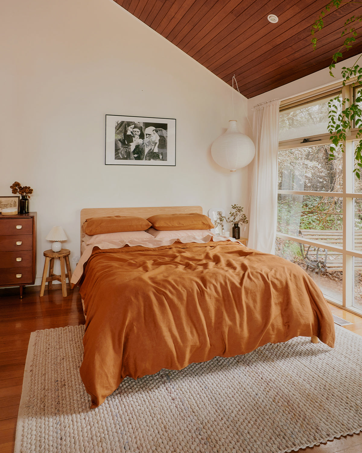
Rust & Terracotta
It’s giving Under the Tuscan Sun but from the comfort of your bedroom: Rust offers that sun-warmed, late-afternoon glow, while Terracotta backs it up with cosy, clay-like warmth. It’s basically golden hour for your bed – minus the need to chase actual sunlight or time anything perfectly.


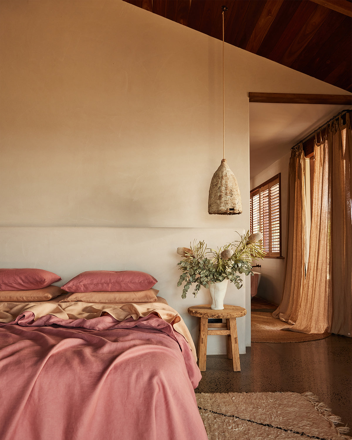
Pink Clay & Terracotta
We’re suckers for a little blush and earthiness, and this duo makes your bed look like it’s been photographed in late-afternoon light. Pink Clay offers a gentle romance while our beloved Terracotta steadies it with depth. Together they feel cosy and sun-kissed.


Hazelnut & Terracotta
Soft on soft, but never sleepy. Hazelnut keeps things mellow and grounded, while Terracotta adds enough warmth to keep the palette from drifting into beige territory. It’s relaxed, textural, and ideal if you’re aiming for “quiet luxury” without trying too hard.
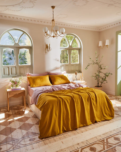


Turmeric & Lavender
Sometimes it’s all about the contrast. Our favourite Turmeric hue shows up with big, optimistic energy, while Lavender strolls in calmly like, “let’s keep this balanced.” It shouldn’t work, but it absolutely does – the colour equivalent of opposites attracting and having unbeatable chemistry.


Crème, Pink Clay & Terracotta
As far as tri-tone bundles go, few are as popular as these three shades. A warm, cosy base layered with earthy blush and desert-inspired hues is finished with an endlessly versatile off-white. It's sweet, gentle, and suitable for all interiors.
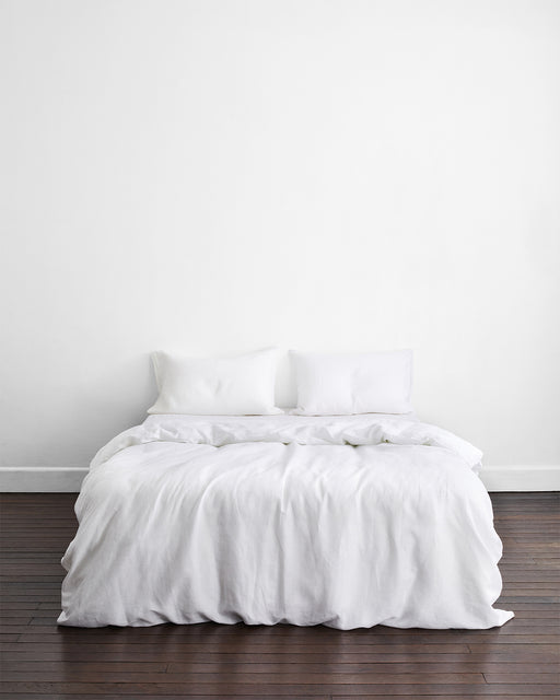


White
The classic that never stops performing. White is fresh, forgiving, and goes with every colour under the sun (and the ones that only appear at dusk). If you’re indecisive or starting from scratch, this is the clean slate that never disappoints.


Olive Stripe & Sage
If you love green but don’t want to commit to fashion’s ‘full look policy’, this is your middle ground. Olive Stripe introduces dimension and personality, while Sage tempers, keeping everything cool and herbal. It’s breezy and just the right amount of interesting.


Coast & Oatmeal
Coast handles the crisp, ocean-breeze side of things; Oatmeal feels like a sandy shoreline. Paired together, they strike that sweet spot between “beach house” and “grown-up home”, without requiring proximity to a coastline.


Cacao & Lagoon
Who says bedding has to be devoid of drama? In this unexpected pairing, Cacao anchors the palette with a rich warmth, while Lagoon lends a cool, moody lift. It’s bold without being overwhelming – the kind of combination that, in our opinion, quietly suggests good taste…
Enjoyed This?
Explore More Popular Colour Combinations


