


14 Spring Colour Combinations To Bring Joy to Your Bedroom
Do you love linen or covet cotton? Either way, there’s a perfect pairing here to inspire your next seasonal refresh.
Ready for some fun maths?
Our iconic Build Your Own Bedding Bundles have five elements: a Duvet Cover, a Fitted Sheet, a Flat Sheet, and two sets of Pillowcases. For the past eight years, linen-lovers have mixed-and-matched Bed Threads’ sheets into combinations of boundless beauty with our timeless colourways.
Now that ten new Organic Cotton colours are in the mix, some (sort of) simple calculations tell us that there are an astounding 28,629,151 possible combinations across these stunning hues. Yes, you read that correctly.
As the days get longer and brighter, there’s no better time to refresh your bedroom. Spring calls for breathable bedding and uplifting colours – soft pastels, fresh whites, warmth, and vibrant pairings that breathe new life into your space.
So if you’re in a bedroom rut, there’s an abundance of inspiration to be found right here. Of course, we could have kept going (and going, and going…), but here are our 22 current favourite combinations. After all, the only equation you need is: new season + new sheets = the perfect reset.
Cotton


Berry, Bubblegum & Butterscotch
From the moment we launched our Organic Cotton range, Berry and Butterscotch were a standout favourite pair – and it’s easy to see why. The eye-catching sorbet-stained shade of Berry adds a splash of vibrancy to the mellow, soothing Butterscotch. But if you feel like this mix could be made sweeter, a pop of Bubblegum perfectly ties together both hues with a lick of pastel.


Bubblegum & Vanilla
This is childhood joy reimagined for grown-up interiors. The buoyant tone of Bubblegum is softened by Vanilla’s creamy neutrality, creating a blend that feels whimsical and romantic. Ideal for interiors that balance sweetness with sophistication.


Vanilla & Butterscotch
Vanilla and Butterscotch share a warmth that feels both smooth and comforting, one leaning creamy while the other leans golden. Their harmony is in the subtleties of shade rather than contrast, coming together in an indulgent swirl of honeyed radiance.

Apple & Crisp White
Where clarity meets vitality, Crisp White and Apple deliver a jolt of brightness. The sharpness of Crisp White draws out Apple’s fresh intensity, heightening the green’s vibrancy. It’s a combination that feels gentle-yet-modern and full of energy.


Sky & Vanilla
Sky and Vanilla are two colours that were made for each other – airy and light with a touch of warmth. The blend has a serene quality that mirrors the rhythm of mornings when everything feels unhurried, and is reminiscent of dreamy, sweeping skies.


Espresso & Vanilla
This duo has proven to be an all-time hit. Espresso’s richness gains dimension beside the velvety calm of Vanilla, the dark and light balancing seamlessly. The result is sophisticated, striking, and completely indulgent.
Linen


Turmeric & Terracotta
For rooms that thrive on energy and radiance, Turmeric and Terracotta recall desert landscapes and golden hours, full of vivid character. Turmeric’s vibrancy amplifies Terracotta’s warmth, creating a palette alive with saturation. This duo doesn’t shy away from intensity, making it feel bold and distinctive.


Terracotta, Rosewater & Lavender
Terracotta provides warmth, Rosewater softens, and Lavender cools – a palette of contrasts that feels unexpectedly balanced. Each colour holds its own, and the combination feels light and fresh, never heavy-handed.


Cacao & Lagoon
Cacao’s earthiness finds contrast in Lagoon’s dusky undertone, a pairing that moves easily between grounded richness and oceanic allure. The tension between the two makes for a bold but versatile palette.


Cacao & Hazelnut
Two delicious hues that are good enough to eat. This duo is layered in tonal warmth: Cacao anchoring and Hazelnut lifting. Together they come together in a blend that feels full-bodied and harmonious.


Olive, Oatmeal & White Stripe
The names alone hint at something wholesome – organic, tactile, and nourishing. Olive grounds the scheme, Oatmeal offers neutrality, and White Stripe introduces freshness and contrast. The trio brings an understated dynamism that feels textured and complete.


Crème, Pink Clay & Terracotta
Romantic without being saccharine, these shades move from gentle Crème to rosy Pink Clay, ending in Terracotta’s grounding depth. It's a colour scheme that feels both timeless and tactile.
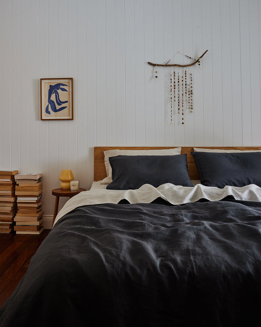


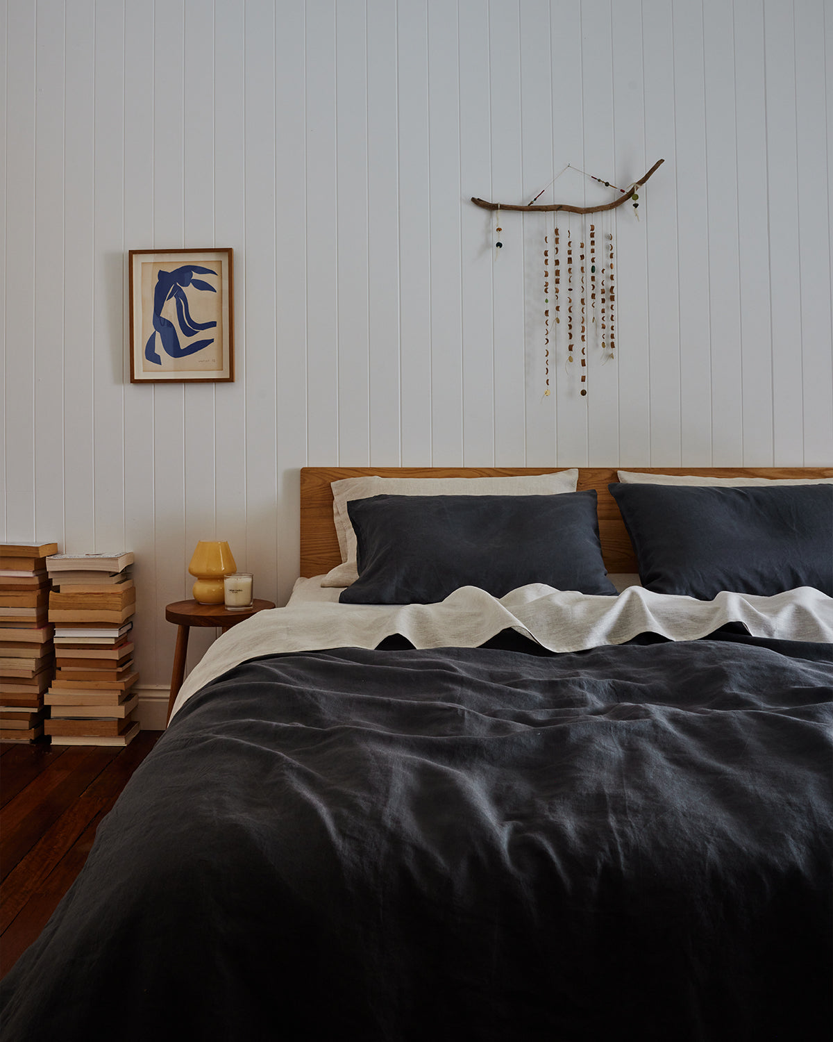
Charcoal & Oatmeal
As timeless as black ink on parchment, this duo thrives on contrast that never feels severe. Charcoal establishes depth and shadow, while Oatmeal introduces subtle warmth. Together they create a grounded pairing that is as adaptable as it is composed.
Enjoyed This?
Discover more about the Bed Threads range.


