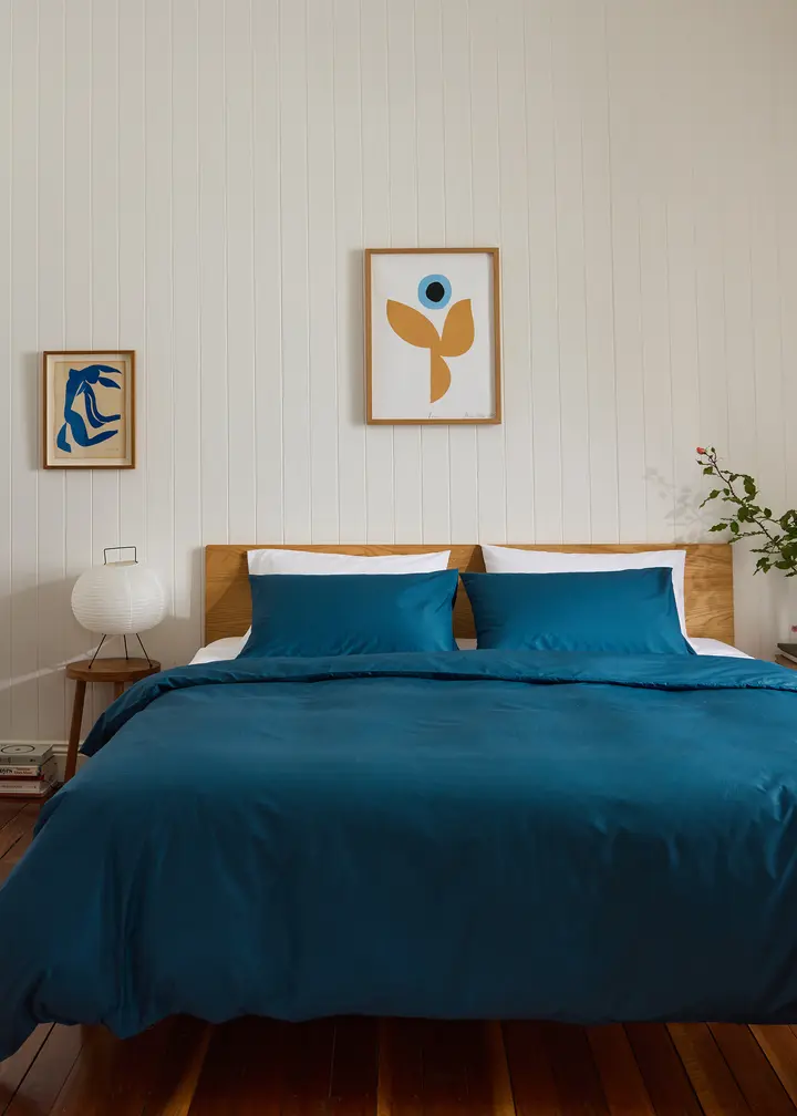
The One Colour Trick That Will Completely Transform Your Space
Minimal effort, maximum effect? We’re sold.
When it comes to interiors, you have probably heard of colour therapy and, if you have a penchant for falling down TikTok rabbit holes like us, colour seasons — but have you heard of ‘colour zoning’?
A technique that can completely transform your space through the intentional use of, you guessed it, colour, we spoke to Cassie Braunthal, senior property stylist at boutique interiors studio Bungalow Home, to learn more about this surprisingly easy décor trick.
“Perhaps the biggest reason I love this technique is that it elevates a home. It’s the kind of detail that makes a space feel considered and high-end, far from generic,” Braunthal tells Bed Threads Journal.
“And the best part? It’s incredibly accessible. With thoughtful colour choices and layering, anyone can use this approach to take their home to the next level.”
Curious? From what to do and what to avoid, read on for everything there is to know about colour zoning.
Is there anything that should be avoided when colour zoning?
When it comes to what not to do with colour zoning, Braunthal suggests three “don’ts” to keep in mind.
1. Don’t just grab the first paint you see
“It’s tempting to fall for a colour in the moment, but always test out a few shades before making the final call,” Braunthal advises.
“Paint can look wildly different depending on the lighting, time of day, and surrounding finishes. Sample it on the actual wall and live with it for a few days, you’ll thank yourself later.
2. Don’t overcomplicate it
Zoning doesn’t mean every corner needs a different colour. Too many zones can overwhelm a space and make it feel busy.
“Focus on the key areas you want to highlight and let the rest breathe. Less really is more when it comes to balance,” Braunthal says.
3. Don’t forget that function comes first
It’s easy to get caught up in aesthetics, but always come back to how the space is used, Braunthal notes.
“A moody colour might look amazing, but is it too dark for a workspace? Does a light, airy tone suit a zone meant for evening relaxation? Match your colour choices with the purpose of the zone,” she says.
Start Colour Zoning
Enjoyed This?
Discover more tips for using colour at home.


